- Magazines -


Design Brief - Ulterior Magazine
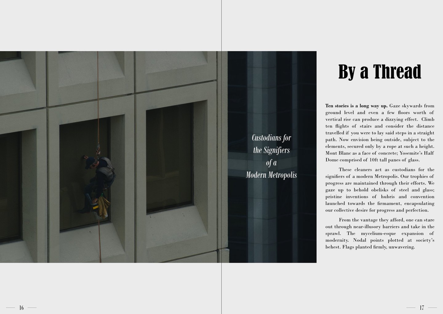
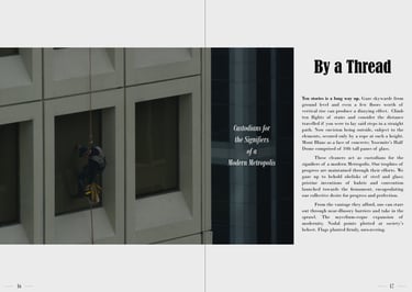
Project Overview:
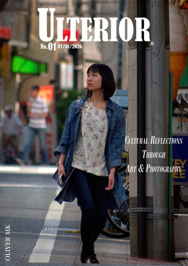
To create a proof of concept for a short magazine/zine centred around art and photography. The aim is to develop a design which feels contemporary yet timeless, perfect for showcasing content through refined visual storytelling and short journalistic copy.
Overall Objectives:
Ensure strong readability whilst prioritising a strong visual identity
Strike a balance between minimalist design, expressive imagery, and simple typography
Convey a curious and sophisticated style, ideal for coffee-table placement
Support writing on themes, tied to visual content, and allow for collaboration for future long-form features
Audience:
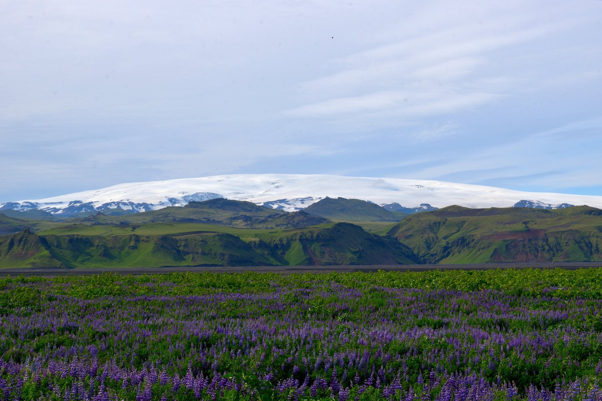
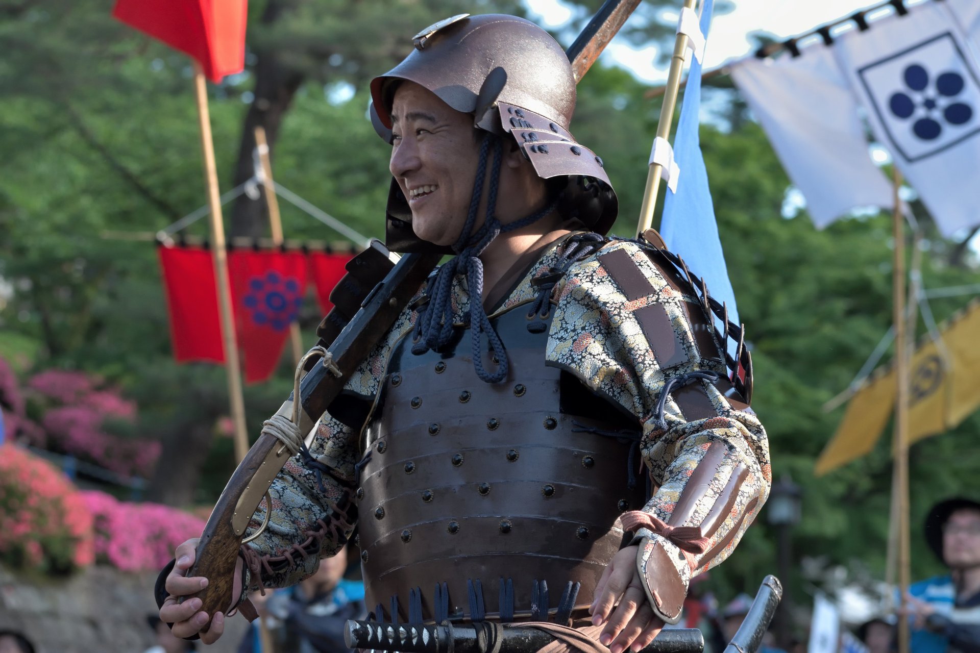
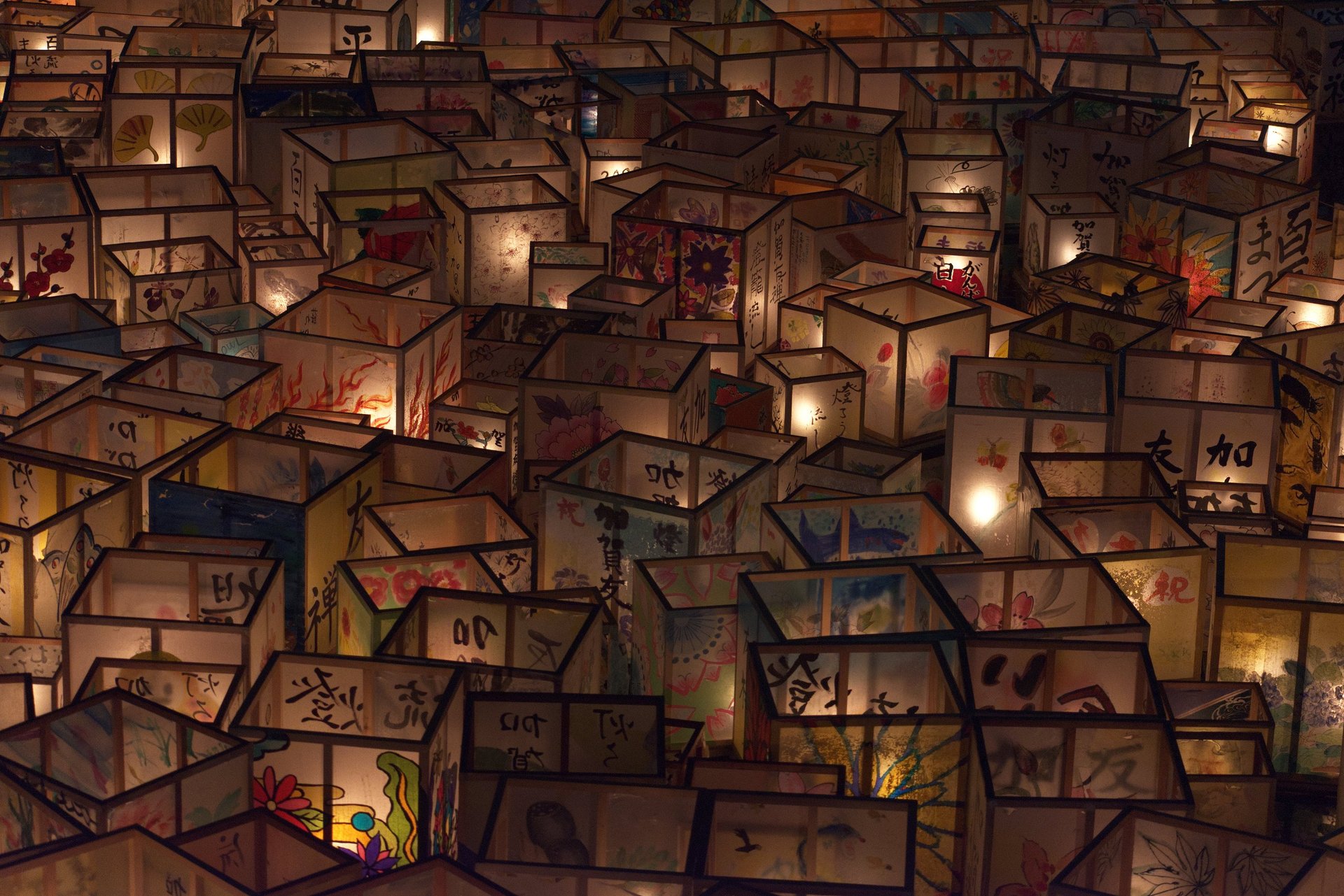
Design aware readers with interests in art, photography, travel, history, architecture, fashion and nature. Typically urban, aesthetically literate, and eager to develop skills.
Visual Direction:
Clean, modern layouts with balance between images and text
Focus on the deliberate use of blank space
Editorial typography which is accessible, but in keeping with the stylized design and featured images
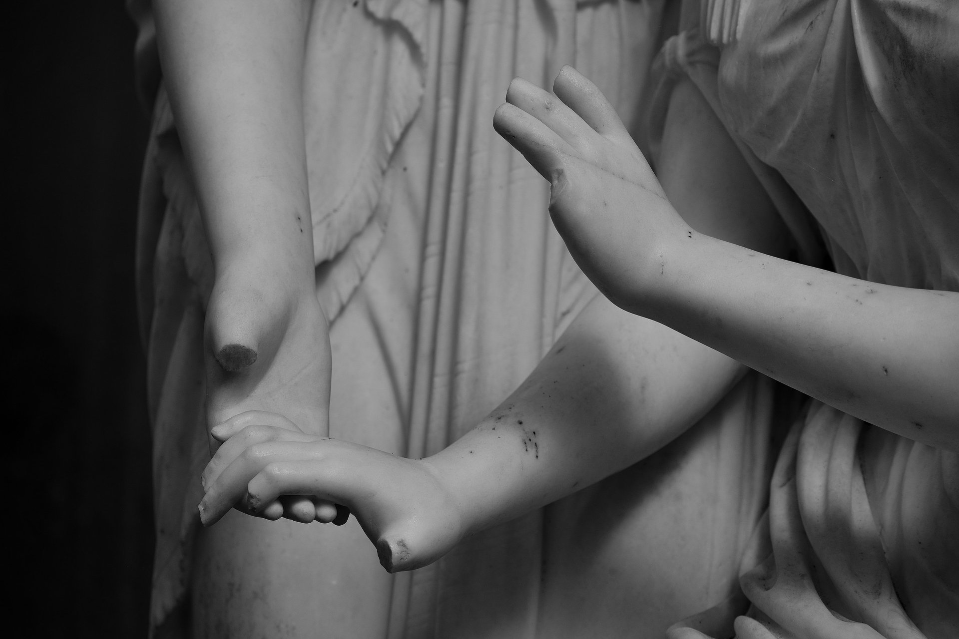
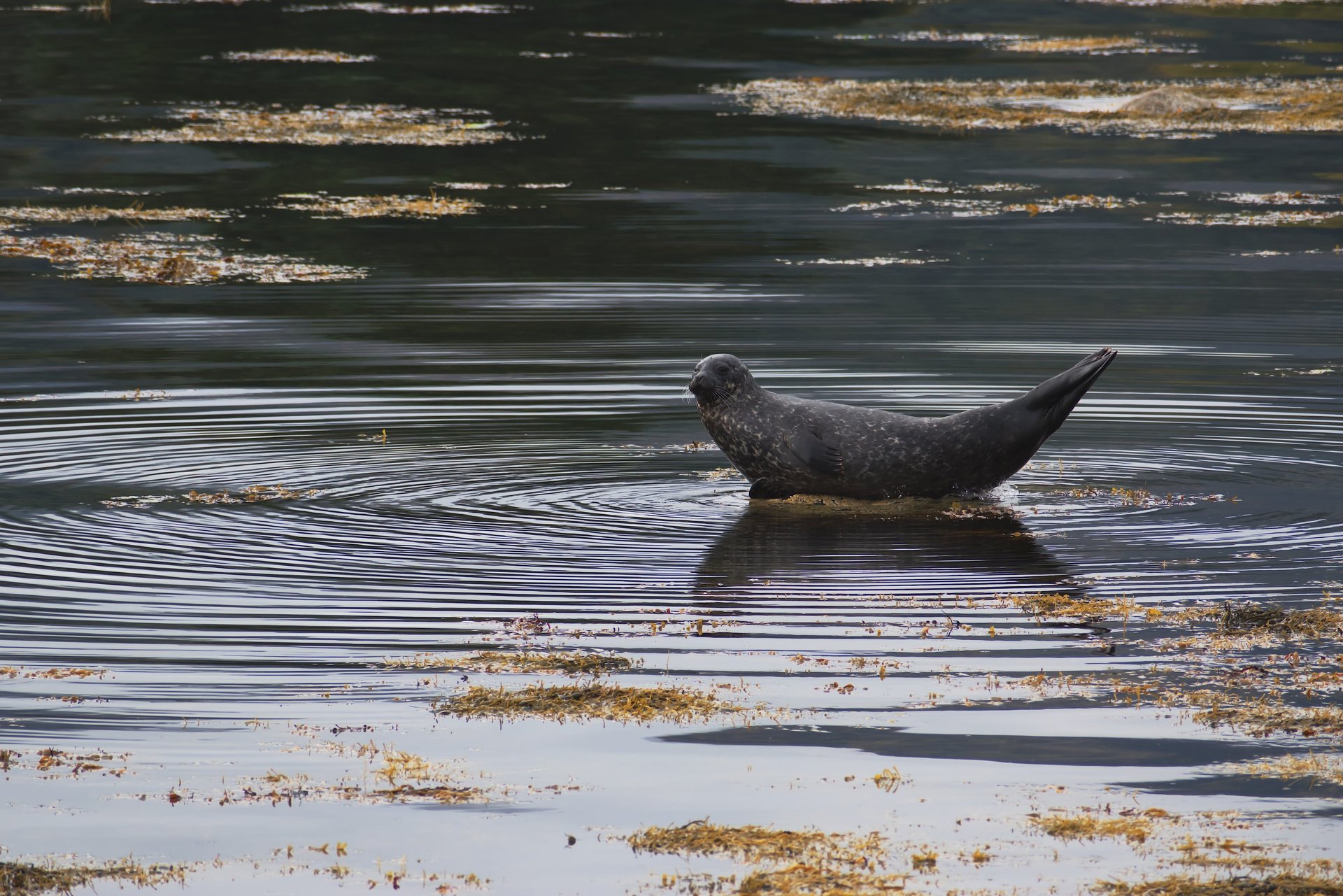
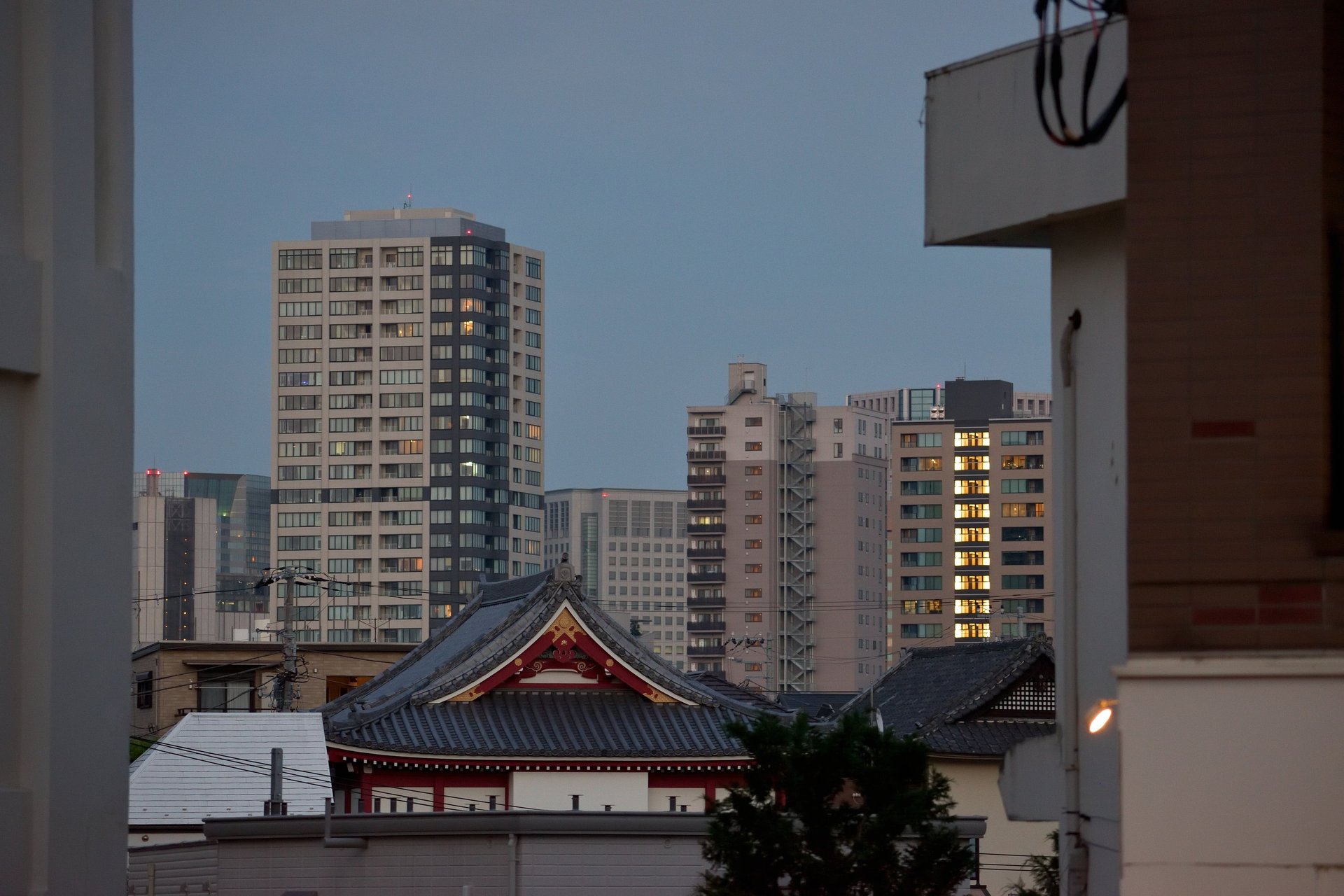
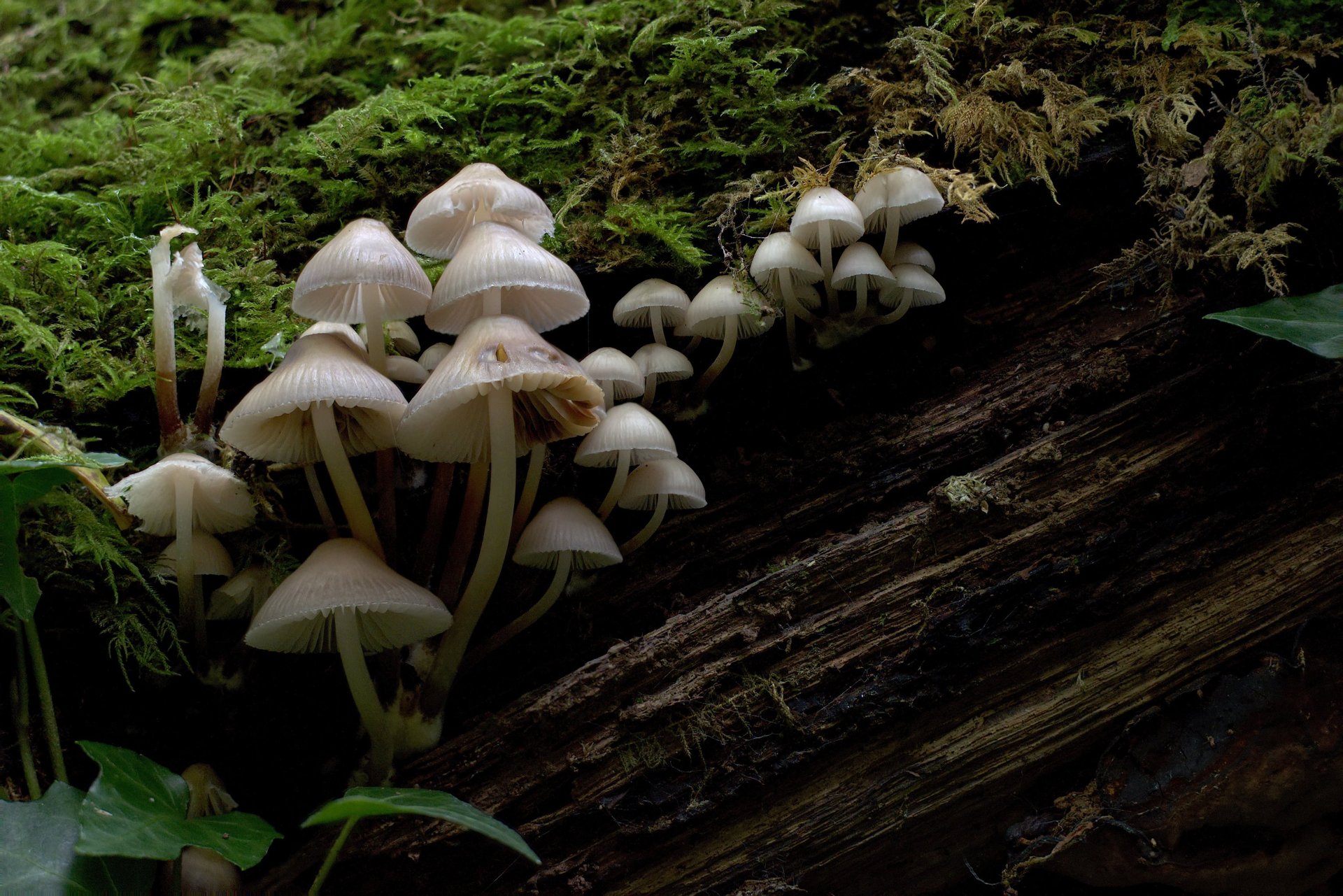
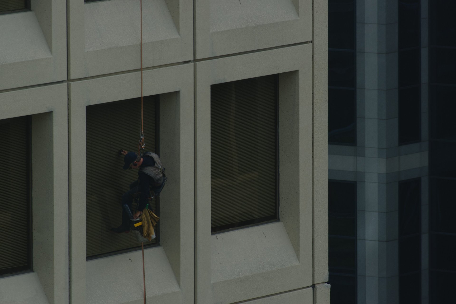
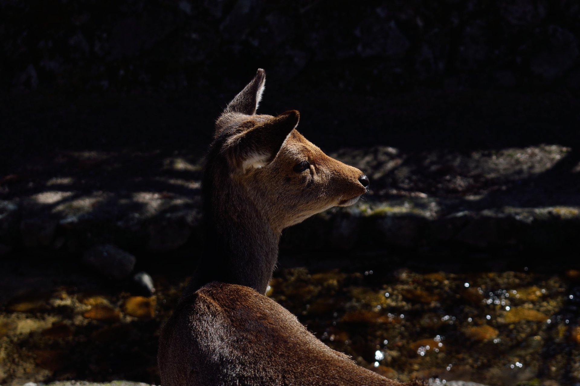
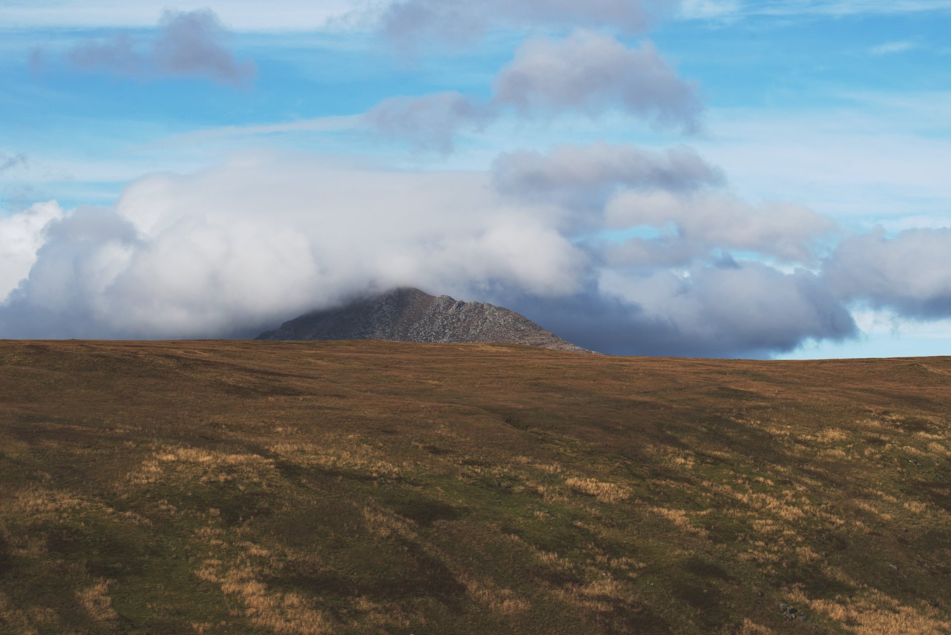
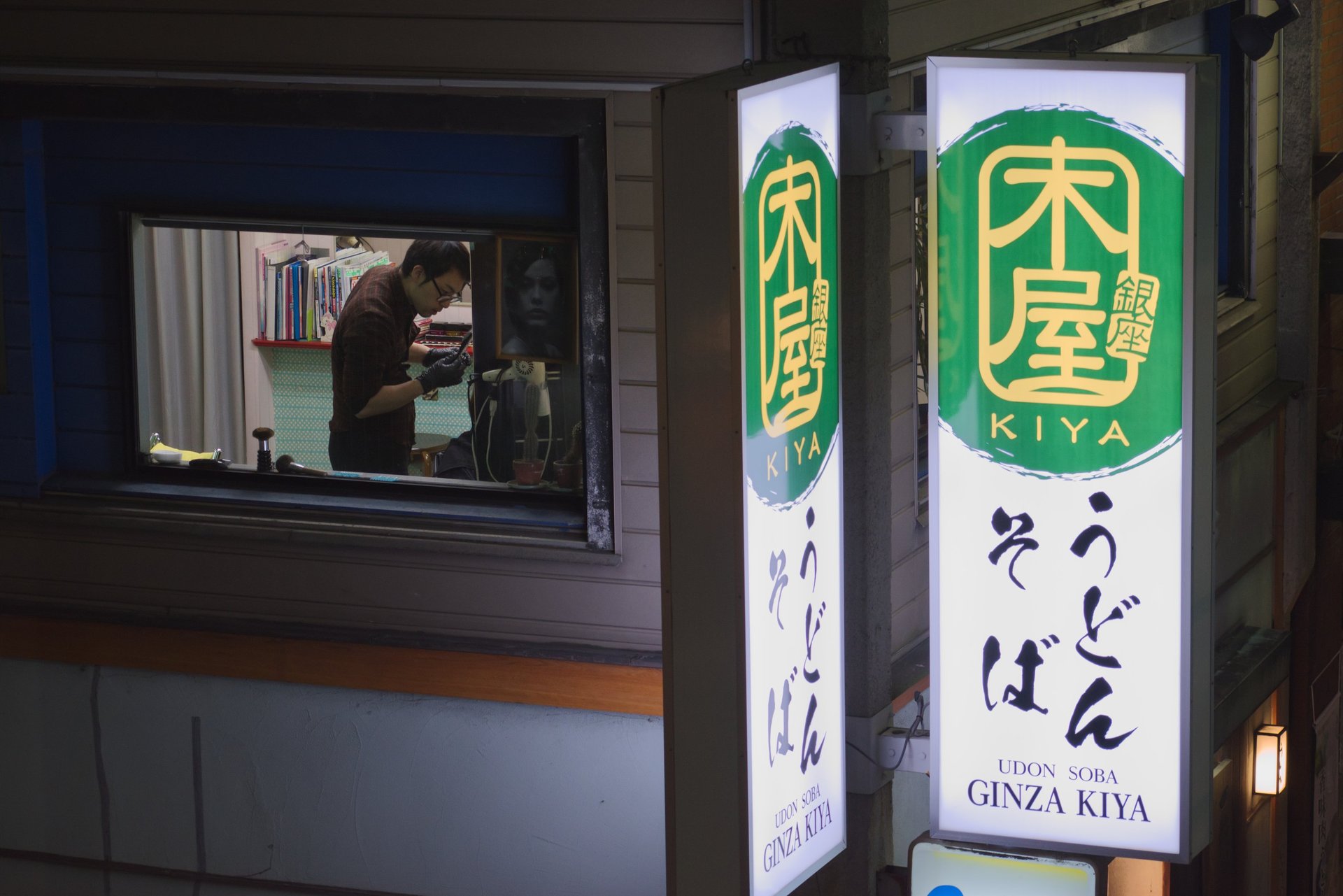
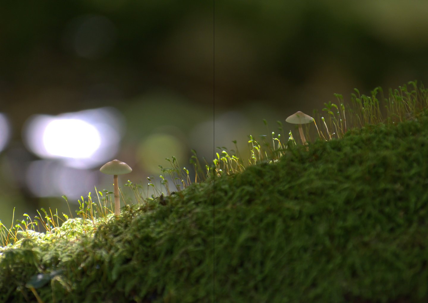
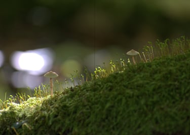
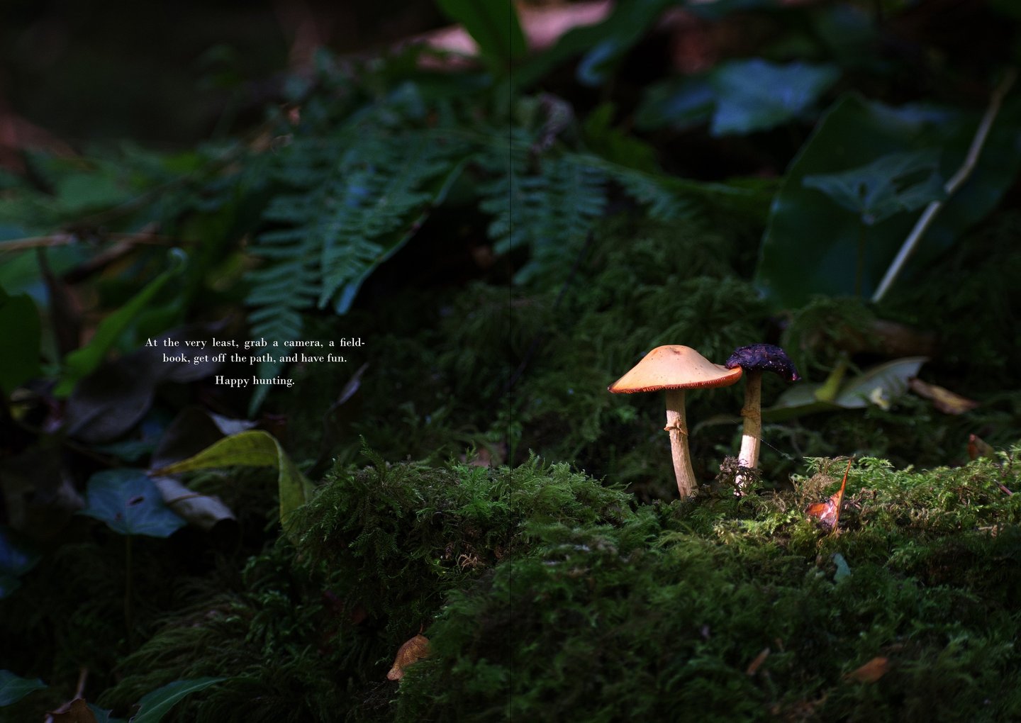
Strong, image-led storytelling with prominent large sized and centrally placed photographs, art and graphic features
A soft, minimalist colour palette with use of strong colours for accents and highlights
Modular grid system for variation and flexibility across content types
Design References:
Brutus (ブルータス); Aesthetica; Apollo; Artforum; ArtReview; Hi-Fructose; Plastikcomb; Juxtapoz
Design Brief - Ulterior Magazine
Project Overview:
To create a proof of concept for a short magazine/zine centred around art and photography. The aim is to develop a design which feels contemporary yet timeless, perfect for showcasing content through refined visual storytelling and short journalistic copy.
Overall Objectives:
Ensure strong readability whilst prioritising a strong visual identity
Strike a balance between minimalist design, expressive imagery, and simple typography
Convey a curious and sophisticated style, ideal for coffee-table placement
Support writing on themes, tied to visual content, and allow for collaboration for future long-form features
Audience:
Design aware readers with interests in art, photography, travel, history, architecture, fashion and nature. Typically urban, aesthetically literate, and eager to develop skills.
Visual Direction:
Clean, modern layouts with balance between images and text
Focus on the deliberate use of blank space
Editorial typography which is accessible, but in keeping with the stylized design and featured images
Strong, image-led storytelling with prominent large sized and centrally placed photographs, art and graphic features
A soft, minimalist colour palette with use of strong colours for accents and highlights
Modular grid system for variation and flexibility across content types
Design References:
Brutus (ブルータス); Aesthetica; Apollo; Artforum; ArtReview; Hi-Fructose; Plastikcomb; Juxtapoz